We Tested 100 Australian checkout Experiences, Here Is What We Found
This is published findings of what customers misunderstand, common reasons for hesitation, CTA clarity, trust issues, and industry comparisons.

A checkout can appear to work perfectly well while still costing a business sales. The payment gateway functions, the fields can be completed, the order button works and analytics shows customers progressing through the funnel. Yet somewhere between the decision to buy and the final payment, confidence can begin to erode. Customers hesitate, re-evaluate the purchase, become frustrated by a seemingly minor obstacle or simply decide that completing the transaction requires more effort than they expected.
We tested 100 Australian checkout experiences to understand where that friction appears and, more importantly, what it looks like from the customer’s perspective. What stood out was that poor checkout experiences were rarely caused by one catastrophic usability problem. More often, they were created by a series of small interruptions at precisely the wrong moment: an unexpected delivery charge, an account requirement, an unnecessarily long form, an unclear total, confusing validation or a payment option that did not appear when the customer expected it to.
These issues can seem trivial when reviewed individually by a product or ecommerce team. A single extra field does not look particularly serious. Neither does a login prompt, a poorly worded error message or a shipping cost displayed one step later than expected. But checkout is different from most other parts of a digital experience. The customer has already decided to act. Every unnecessary interaction introduced at that point risks weakening the momentum that brought them there.
Checkout is still part of the buying decision
Many businesses implicitly treat checkout as an administrative process that begins after the customer has made their purchasing decision. From that perspective, the job of checkout is simply to collect the information necessary to fulfil an order: contact details, delivery information, payment details and confirmation.
Customers experience it differently.
The decision to purchase remains active throughout checkout. A customer who was completely comfortable with a product on the product page can suddenly become uncertain when delivery costs appear. Someone who intended to buy can reconsider when asked to create an account. A customer who trusts the brand can begin questioning that trust when an error message appears without explaining what went wrong. Someone who was comfortable with the advertised price can hesitate when the final amount no longer matches what they thought they were going to pay.
“Is this really going to cost what I thought? Can I trust this business? Why do they need this information? What happens if something goes wrong? How much longer is this going to take?”
This means checkout sits at an unusual intersection between usability and psychology. Customers are completing a task, but they are also continually assessing whether proceeding still feels worthwhile, safe and predictable.
Across the experiences we tested, the strongest checkouts reduced the need for customers to stop and think. They made the next action obvious, kept costs transparent, asked only for necessary information and provided reassurance at the points where uncertainty naturally emerged. The weaker experiences repeatedly introduced questions the customer had not needed to consider before entering checkout.
Six friction points appeared again and again
Account friction
- Login and registration requirements interrupted customers who were already trying to purchase.
Unexpected costs
- Delivery charges, fees and changing totals caused customers to reconsider the value of the purchase.
Form overload
- Checkouts frequently requested more information, and more effort, than customers expected.
Poor error recovery
- Customers were told something was wrong without being clearly shown how to fix it.
Payment friction
- Preferred payment methods, saved information and accelerated payment options were not always easy to access.
Trust gaps
- Returns, delivery, security and other reassurance often disappeared precisely when customers became financially committed.
Forced account creation introduces a second decision when customers are trying to complete the first
One of the clearest sources of friction was account creation. In a surprising number of checkout experiences, customers were still encouraged, or in some cases required, to create an account before completing their purchase.
From an organisational perspective, account creation has understandable benefits. It can provide better customer data, support loyalty programmes, simplify future purchases and make ongoing customer management easier. The problem is that none of those objectives necessarily matter to the customer at the moment they are trying to buy.
Their objective is simply to complete the transaction.
When a checkout suddenly asks someone to choose a password, remember whether they have purchased before, retrieve forgotten credentials or verify an email address, the business has effectively inserted a second task into the middle of the first. The customer is no longer just buying a product. They are also being asked to establish a relationship with the organisation.
This tension between the organisation’s objectives and the customer’s immediate goal is one of the most important distinctions we observed.
A famous precedent: the “$300 Million Button”
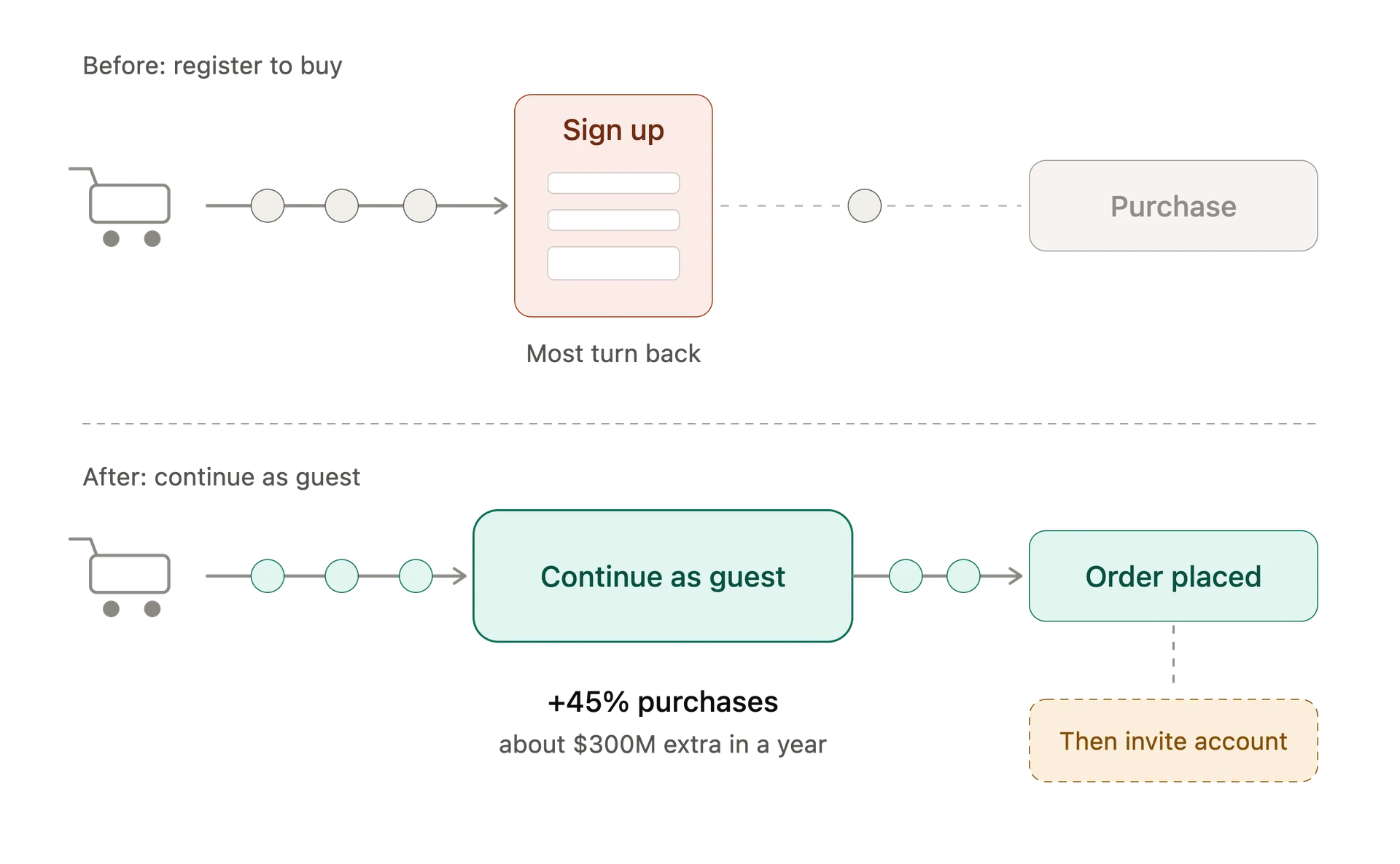
In usability testing for a major ecommerce retailer, Jared Spool’s team found that requiring customers to register before purchasing was creating significant friction. New customers resisted creating accounts, while existing customers frequently could not remember their credentials.
The retailer allowed customers to continue without registering. Spool later reported a 45% increase in purchases, with approximately $300 million in additional sales during the following year.
The important lesson wasn’t the button itself. It was that a commercially sensible requirement was interfering with what customers had actually arrived to do: buy.
We saw the same underlying tension repeatedly. Businesses were attempting to optimise for future customer value before successfully completing the transaction already in front of them.
Account creation might still be valuable, but checkout is often the wrong moment to make it compulsory. Completing the purchase first and inviting customers to create an account afterwards protects the primary customer goal without abandoning the organisation’s longer-term objective.
Customers become highly sensitive to unexpected costs
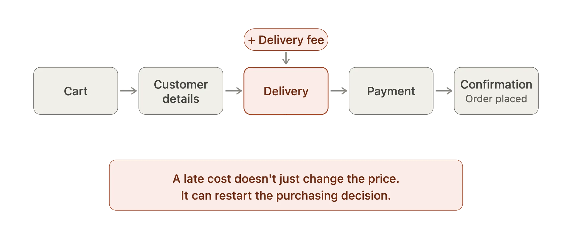
The second major pattern concerned price transparency. Customers entered checkout with a mental expectation of what they were about to pay. Whenever the checkout disrupted that expectation, friction increased quickly.
Delivery charges were the most common example, but the issue extended beyond shipping. Service fees, payment surcharges, minimum-order conditions and other additional costs could all create a disconnect between the price customers believed they had agreed to and the amount eventually presented to them.
The usability problem here is not simply that customers dislike paying more. It is that the checkout changes the terms of the purchase after the customer has already invested effort in reaching it.
A $10 delivery charge displayed clearly before checkout can become part of the purchasing decision. The same $10 introduced unexpectedly near the end of checkout can feel like a penalty for proceeding.
This behaviour is consistent with broader checkout research.
Baymard Institute’s long-running ecommerce research has repeatedly identified unexpected additional costs as one of the leading reasons customers abandon purchases. Its research has also found that customers abandon when they cannot determine the total cost of an order early enough.
Our testing reinforced why this matters. Customers want to understand the financial commitment they are making before investing effort in forms and payment. When the amount changes late in the journey, they often stop thinking about how to complete the checkout and start reconsidering whether they should complete it at all.
Strong checkout experiences therefore do not merely display the final price correctly. They establish price confidence early and maintain it consistently.
Many checkouts still ask customers for more information than they need
Another recurring problem was form length.
Long forms are often treated as a visual design issue, but the underlying usability problem is broader. Every field represents another request being made of the customer. If the reason for that request is not obvious, customers can begin questioning why the organisation needs the information at all.
Some checkout experiences asked for details that appeared unnecessary to fulfil the transaction. Others split simple information across multiple steps, creating the perception of a longer process than was actually required. In several cases, optional fields were visually indistinguishable from mandatory ones, forcing customers to work out what they could safely ignore.
- Re-entering information already supplied earlier in the journey
- Requiring phone numbers where their purpose was unclear
- Asking for information unrelated to fulfilment or payment
- Treating optional fields as though they were mandatory
- Separating simple information across unnecessary steps
- Requiring password creation during the purchase
- Poor support for browser autofill and saved addresses
The impact of unnecessary fields is cumulative. No single field is likely to cause abandonment on its own. The problem emerges when customers encounter one unnecessary request after another.
Baymard’s checkout usability research has documented this problem extensively, finding that many ecommerce checkouts display considerably more form elements than are actually necessary to complete a purchase.
Our testing showed the same principle in practice. The better experiences were not necessarily the shortest, but every question appeared to have a clear purpose. Customers could understand what was being requested and why.
Poorer experiences often made the customer do work because the organisation’s systems required it, rather than because the customer’s task required it.
That distinction matters.
Error messages often tell customers something is wrong without helping them fix it
Validation was another area where seemingly small usability problems had disproportionate impact.
The weakest error states simply informed customers that something was invalid. They might highlight a field in red, display a generic message such as “Please check your information”, or prevent the customer progressing without explaining exactly what had happened.
This forces customers into diagnosis mode.
Instead of completing the transaction, they now have to investigate the interface. Which field is wrong? Is the formatting incorrect? Is information missing? Has the payment failed? Was the card rejected, or did the website experience an error?
Creates friction
- “Something went wrong.”
- “Invalid details.”
- “Please check the form.”
- A red outline without an explanation.
Keeps momentum
- “Enter your card number without spaces.”
- “This postcode doesn’t match the selected state.”
- “Your card wasn’t charged. Try another payment method.”
- Clear guidance beside the affected field.
The strongest checkout experiences removed ambiguity. They explained what was wrong close to the relevant field and, wherever possible, showed the customer how to fix it.
This distinction can look minor in a design review because both versions technically contain an error message. In usability testing, however, the difference is obvious. One keeps the customer moving. The other creates uncertainty.
The closer someone gets to payment, the more damaging that uncertainty becomes.
Payment is not merely a transaction method. It is also a trust signal.
Payment options were another recurring point of friction. Customers increasingly arrive at checkout with established expectations about how they want to pay. When those options are unavailable, difficult to find or presented differently from what the customer expected, the issue can quickly move beyond convenience.
Payment also communicates legitimacy.
Recognisable payment methods, familiar wallets and clearly presented transaction information can reassure customers that the purchase is safe. Conversely, an unfamiliar or poorly presented payment experience can create doubt even when the underlying payment infrastructure is entirely secure.
The important point is not that every retailer should implement the same payment product. It is that effort at the payment stage has measurable commercial consequences.
When customers have already decided to pay, requiring them to repeatedly enter information the business or payment provider already knows rarely creates additional value.
Trust problems appear at the precise moment customers become financially committed
Trust was one of the more subtle patterns across the experiences we examined because customers rarely described it explicitly as “trust”. Instead, it appeared through questions.
“When will it arrive? What happens if I need to return it? Is this payment secure? Is this really the final amount? Can I cancel the order? What happens if something goes wrong?”
These questions matter because checkout is the point at which browsing becomes financial commitment.
Some businesses provide extensive reassurance elsewhere on their website but remove it from the part of the experience where customers need it most. Return policies might be clearly described on a dedicated page, for example, but disappear entirely during checkout.
The customer is then expected either to remember information they encountered earlier or leave checkout to find it again.
If customers have a predictable concern at the moment they are committing money, answering that concern within the checkout can be more valuable than forcing them to search for reassurance elsewhere.
The best checkout improvements were often surprisingly small
Perhaps the most important conclusion from reviewing these experiences is that checkout optimisation does not necessarily require a major redesign.
Some of the strongest opportunities existed in very small decisions. They were not radical experience transformations or major technology programmes. They were targeted changes that removed unnecessary reasons for customers to hesitate.
- Allow guest checkout instead of forcing registration
- Show delivery costs before customers invest effort in checkout
- Remove fields that are not required to complete the transaction
- -ake the final amount easy to understand
- Explain errors and tell customers how to fix them
- Support autofill and stored customer information properly
- Make preferred payment methods obvious
- Keep returns, delivery and security reassurance close to the decision
- Make the primary checkout action visually unmistakable
These are not particularly glamorous design interventions.
They are also exactly the type of problems that organisations can easily overlook internally because employees already understand how the system is supposed to work.
Customers do not have that knowledge. And that is where usability testing becomes particularly valuable.
Analytics tells you where. Usability testing helps explain why.
Analytics can tell a business that customers are abandoning checkout between delivery and payment. It cannot reliably explain why.
Funnel data might identify the page with the highest exit rate, but it cannot tell you whether customers were surprised by shipping costs, confused by an address field, uncomfortable with the payment options, unable to recover from an error or simply uncertain about what would happen next.
Watching customers attempt the transaction changes the nature of the evidence.
Instead of debating what might be wrong, teams can see where behaviour changes. They can hear the questions customers ask, observe the points where confidence drops and identify the specific interaction creating unnecessary effort.
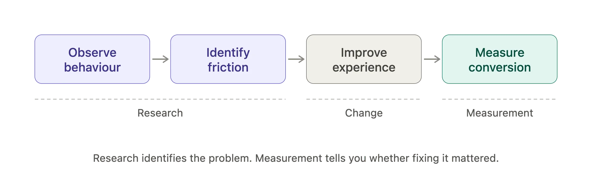
Observe
- Watch customers attempt the real task.
Understand
- Identify what caused hesitation, confusion or failure.
Change
- Remove or redesign the specific source of friction.
Measure
- Use conversion data, experimentation and further testing to determine whether the change worked.
This combination is important because usability testing and analytics answer different questions.
Analytics identifies behavioural patterns at scale. Usability testing provides evidence about what may be causing those behaviours. Experimentation can then determine whether changing the experience produces a measurable commercial effect.
The strongest checkout optimisation programmes use all three rather than expecting any one method to provide the entire answer.
Checkout optimisation is ultimately about protecting intent
The common thread across the checkout experiences we tested was not visual design, technology or even form usability.
It was momentum.
By the time a customer reaches checkout, a business has already done a considerable amount of work to create purchase intent. Marketing generated awareness. The product created interest. Pricing established value. Content answered questions. The customer made a decision.
Checkout's job is to avoid unnecessarily weakening that decision.
The strongest experiences did this by making the process predictable. They exposed costs clearly, reduced unnecessary effort, allowed customers to proceed without unrelated commitments, supported familiar payment behaviours and answered questions before those questions became reasons to leave.
The weakest experiences introduced organisational complexity directly into the customer's journey.
And that is perhaps the most important finding.
A checkout does not need to be obviously broken to be underperforming.
Sometimes the difference between abandonment and conversion is simply one unnecessary question, one unexpected cost or one moment when the customer stops moving forward and starts reconsidering the purchase.
The question isn’t simply whether customers can complete the checkout.
It’s whether anything in the experience gives them a reason not to.
For teams trying to improve conversion, that makes checkout one of the most commercially valuable places to observe real customer behaviour. Small usability problems at the final stage of the journey can undo considerable effort spent acquiring and persuading a customer before they ever reached it.
The opportunity is therefore not simply to make checkout easier.
It is to remove the moments that cause customers to reconsider a decision they had, until that point, already made.